Showing posts with label retail. Show all posts

Nike+ Fuelstation by Nike, London Boxpark

Wednesday, June 13, 2012 at 1:18 AM


Nike presented its vision of 'future retail' by opening the first Nike+ Fuelstation in East London's Boxpark.


Envisioned by Nike’s Netherlands-based team, the concept space strives to offer an innovative balance of digital interactivity with physical human experience.


The space is maximized with digital interventions designed to motivate and inspire the concept of getting active. Motion-sensing LED walls run floor-to-ceiling, changing colour from red to green as customers walk past. As an alternative to conventional mannequins, motion-sensitive smart mirrors reveal film footage of local runners wearing products from the store. Interactive touch screens provide information on Nike+ products and Run Clubs.


One of the highlights is a clever Kinect hack installation that allows visitors to create a life sized digitized version of themselves on screen. The result is a unique motion graphic that can be uploaded and shared via social media.


The store will become the hub of a free weekly Nike+ Run Club for locals whilst nutritionists and physiotherapists will be on hand to offer free consultations and advice.


Giorgio Armani, 5th Avenue New York

Wednesday, October 5, 2011 at 8:20 PM


After Hong Kong Chater House and Tokyo Ginza Tower, Fifth Avenue completes the trilogy of the Armani Stores designed by Doriana and Massimiliano Fuksas for the famous designer. Situated in the centre of New York, in one of the street more known, the project takes up the first three floors of two buildings localized between the 5th Avenue and the 56th Street. Besides the basement, the show room develops on four differents levels and it’s conceived of an only space, without clear distinctions, a singing space connected with the power generated by the whirlwind of the staircase.


The nucleus of the project is the staircase that connects the floors. It’s a structure wrought with the radiator grill of steel, covered with plastic material that highlights the look of sculpture. It’s an element completely indipendent that can be assimilated with difficulty to a simple geometric figure, that originates a whirlwind with a great dymanism, and around of it there are the different levels that receives the Armani’s world.


The movement of the ribbons that constitutes it, brings to the different floors, just skimming them and disenchanting the possibility to recognize the geometry and the static. The same movement arrives to lap the vertical surfaces tranferring to it a share of the dynamism. The general layout of every floor develops on the always different flexures, that enriches of shades the lightness of wall coloured mastic.


No element is extraneus to the internal dynamism, not even the external façade; even if lined up to rigid orthogonal stitch of Manhattan, simulates the movement through images and shades projected on a set of LED thread. This screen, other than being the projection to the outside of the internal space, is also a particolar tribute to New York city, to the inescapable necessity to compare with his modernity and his dynamism. The fluidity of the internal space is rendered by the wall of continous thread, that are realized with wood panels lacquered monochrome. The different rays of bends that outlines the threads give rise to fields and handles for the different product areas.


On every points the foldings of the threads gives hospitality to the dressing-room and the vip hall, in other points there are areas reserved to the staff, cash desk, or special product areas like Armani Dolci. A particular importance is given by the enlightenment that defines, characterizes and emphasizes the bends of the walls and of the spaces, and highlighting the different functions of the general layout. Every element of the internal design, from the ehxibitors to the rooms to hang up the clothes, from the desks to the armchairs, follows and satisfied the movement concept generated by the staircase, becoming a part of the same whirlwind. Also the disposition and the route that it implies, outiline singing layout.
There is a conflicting between the shine of the colour of the walls and of the furnishings, and the noir of marble pave and of the false ceiling. There is also a conflicting between the apparent simplicity of the internal space and the coffe and restaurant area that give advance notice of the elevator’s entrance. The bronze refolded and bended, that covers them, acquires and reflects the colours and the shades that gave notice of a mew atmosphere.


Inside the restaurant, filtered by a amber veil, there is a splendid view of the 5th Avenue and in the end of Central Park. The colours and the materials utilized are the same of the rest of the show room, but the suggestions are nwe and different. The space become recreational, a line of light on the floor that leads to the entrance of the restaurant underlining the sensuality of the bends of the wall. A virtual curtain, they active the passage and as a theater…the show begins!
Doriana and Massimiliano Fuksas said: “The building that incorporates Armani/5th Avenue holds a very important place in the history of architecture because its façade is one of the first examples of the “International Style”. When one is dealing with such a cultural milestone, one must always bear in mind that the exterior is totally New York, while the interior should have its own identity. A reflection of the flair and aesthetic values that define the Giorgio Armani style.


The grand staircase is the focal point, an exciting sculptural feature which connects all the different levels that accommodate the Armani universe range by range. Innovative in both layout and content, Armani/5th Avenue is the first concept store in which all the Armani products are presented in a single space, where the same design has been adopted throughout: the subtle colours and restrained shapes emphasise the value of the product.”

Architect: Doriana & Massimiliano Fuksas
Client: Gruppo Giorgio Armani
Structural Engineering: Gilberto Sarti
Project consultant on the site: Davide Stolfi
Lighting design consultant: Speirs & Major Associates


Gerngross

Tuesday, August 23, 2011 at 9:45 AM


1. Restructuring the Existing Centre

The layout of the store was not intuitive. Walkways were complex and confusing, and it was difficult to navigate. To improve this, the layout of the indoor levels (G, 1st, 2nd, and 5th) has been entirely re-designed and smaller retail spaces have been added. The key to designing the individual levels was to think “empty” in order to enable the future implementation of an improved orientation system.

Before reconstruction
The preconditions for this complex undertaking were:
  • For each rental space, a newer space of equal size but higher quality had to be provided.
  • Each tenant had to be relocated twice during the construction time.
  • The ongoing daily shopping activity should be only minimally disturbed.


2. Create a new Centre!

To this end, the atrium, with its escalator network, took centre stage. The atrium serves as the nucleus and has become the store’s central orientation point.


3. The Atrium: a sweeping upward perspective

The atrium, which unites the horizontal and vertical visual axes, has becomes the store’s new nucleus and central orientation point. The ceilings of the individual levels are rounded and “rolled” upwards. In this way, the atrium expands up towards the retail levels, appearing larger and more open than the atrium in its previous incarnation. The atrium and retail areas seem to melt together, bringing the individual levels into a mutual dialogue and making the store into a special continuum.

This effect is supported by the lighting and materials strategy:
Both the materials and the manner of material transitions within the individual levels are also present in the atrium (large perforated metal areas appear as if emerging from a white foundation). The light fixtures, placed freely on the ceilings of each level, cover the rounded bends of the atrium and the escalators, until they are transformed into light points vertically set in the perpendicular cladding of the central room.
Overall, the atrium appears light and dynamic – the relatively short individual storeys now appear lofty.


4. The Interior

The retail areas of the new store are distributed like ice floes on each story. These floes are marked by a change in floor covering and ceiling material, thereby forming a star-shaped pattern of paths on both the ceiling and the floor. In this way, the materials on the floor and ceiling facilitate orientation within the building. Paths and retail areas are explicitly marked and visible from afar:
Large perforated metal areas in the ceiling demarcate the retail areas. These areas form a multifunctional, highly flexible ceiling system and house the primary technical installations, security technology and product lighting. In contrast, the network of paths is mirrored with a high-quality plasterboard ceiling. Both ceiling concepts flow in rounded edges up over the entire atrium. Together with the escalator panelling, this creates a unified effect that stretches across the entire interior of the Gerngross department store. The interior is then expanded through resting station, sitting lounges and temporary displays.


5. The Gerngross Facade

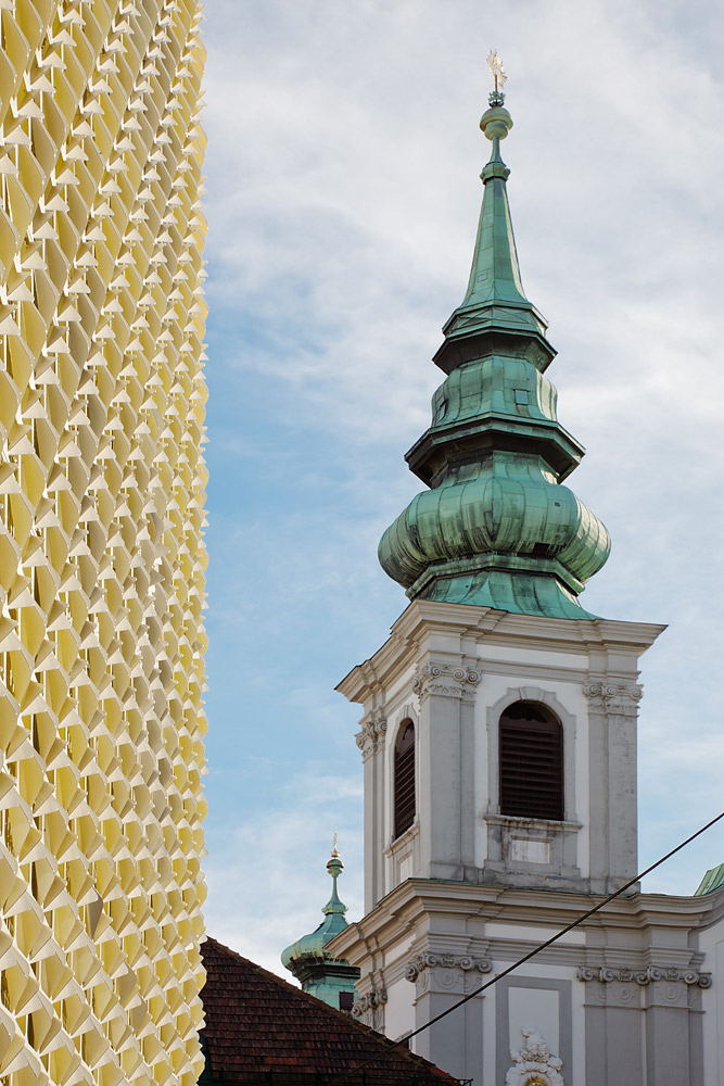
The facade of the new building forms the logical continuation of the interior: the ice-floe theme of the interior space continues on the new facade. To this end, large-scale, amorphous colour fields were applied. Leaving some space in between, an ornamentally designed, semi-transparent white area was then attached. Together, these layers form a conglomerate of light and colour.
In the evening, this effect is reinforced by a lighting concept between the two layers of the facade. A large-scale white frame also emphasises some areas of the facade (e.g. main entrance, bay), thereby showing them off to their best possible advantage.
Due to the large scale of the facade, the entire building is harmonized, and the true size of the building is emphasised. Advertising media, such as logos and slide-in plates, have been aggregated and drastically reduced as compared to their former state.
The ornamental pattern was designed to ensure a continuous view from the building into the street space (50% free cross-section). Furthermore, the entire facade was thermally reengineered and technically modernised, so the ornamental pattern functions simultaneously as sun protection.


6. The “Tilting Effect”

Depending on where they stand, viewers perceive the facade differently:
From a level viewing angle, it appears more like a white-ornamental field. As the viewing angle gets steeper, the background colour of the house comes more strongly into focus. This creates a tilting effect, which follows the passers-by.